Cards
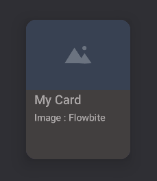
Card {
	CardImage(
		"https://flowbite.com/docs/images/examples/image-1@2x.jpg",
		"Image"
	)
	CardTitle("My Card")
	CardText("Image : Flowbite")
}
The Card components comes with a set of content components for Images, Titles and Text.
Each component comes with its own styling options.
The main component, Card, has a onClick callback for handling card interactions.
Card(onClick = {}) { ... }The text components has a color argument for changing the color of the text if the color is not set in the style settings.
CardTitle("Title", color = "myColor")

CardText("Text", color = "myColor")
When using the CardImage component a source to the image and an alternate text is required.
CardImage(url, "Alternate image text")
It is also possible to use a local image with R
CardImage(R.drawable.image, "Alternate image text")