Buttons
The Button component is located at org.android.aui.clickable.Button
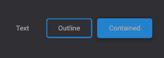
Button(type = ButtonType.TEXT)
Button(type = ButtonType.OUTLINED)
Button() // Default is ButtonType.CONTAINED
The button uses the ThemeProvider to get its color for both background and text.
But by providing backgroundColor or color in the button style parameter - or by setting the color parameter - the buttons color and content color will change.
Button(
	onClick = {},
	type = ButtonType.CONTAINED,
	color = "primary",
	style = DefaultStyles.Clickable.button,
	disabled = false
) {
	...
}
Disabled and Enabled Buttons
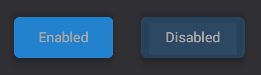
Button() { ... }
Button(disabled = true) { ... }